Page 30 - Decor and Lifestyle Issue 2 2025
P. 30
Design for the


        NEURODIVERSE MIND


            very home is a conversation with the   Hard surfaces amplify sound; glossy finishes bounce light; open plans offer no
            senses — and for neurodivergent   retreat from activity. For someone whose senses don’t filter input easily, the
       Epeople, that conversation can be      result is constant background tension.
        overwhelming. Flashing lights, echoing
        spaces, hard textures, visual clutter —   The fix isn’t expensive. It’s intentional.
        all these common design choices can    •  Introduce zoning — visual or spatial cues that separate noisy and quiet
        exhaust a brain wired for sensitivity.   areas.
        Yet few homes are designed with these   •  Use absorbent materials — rugs, curtains, upholstery — to soften acoustics.
        realities in mind.                     •  Reduce visual clutter by keeping horizontal surfaces clear and storage
                                                 closed.
        The neurodiverse mind doesn’t need
        special treatment; it needs thoughtful   These small acts of design can turn chaos into calm.
        design. Spaces that regulate, not
        overstimulate. Homes that offer both   The science of comfort: layout, acoustics, colour
        calm and choice. The shift begins when   Comfort isn’t aesthetic; it’s neurological. Research in Frontiers in Psychology
        we start designing not for perfection,   shows that acoustics, light, and layout directly affect emotional regulation. A
        but for comfort that includes everyone.  room with balanced sound absorption, predictable spatial flow, and warm but
                                              neutral colour tones can lower stress hormones measurably.
        Sensory overload in modern homes
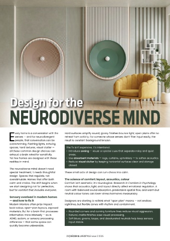
        — and how to fix it                   Designers are starting to rethink what “open plan” means — not endless
        Modern interiors often prize impact:   sightlines, but flexible zones with rhythm and containment.
        bold colour, open-plan layouts, exposed
        materials. But for a brain that processes   •  Rounded corners and curving furniture lines reduce visual aggression.
        information more intensely — as in     •  Natural, matte finishes ease visual processing.
        ADHD, autism, or sensory processing    •  Soft blues, greens, taupe, and desaturated neutrals help keep sensory
        difference — that same space can         input stable.
        quickly become unbearable.


                                                28 | DÉCOR & LIFESTYLE Issue 2 2025

